Since Jack Kennedy asked “not what the country could do for you,” the stock market has been up in 35 years (measured starting on Inauguration day or the first day of trading after the 20th of January and going through to the next 1/20) and down in 15. In other words, there is a 30% chance of a down year. It has been up by double-digit percentages in 24 years, so the probability of a good year (a positive double digit return) is 48%.
What would you say if there was an indicator that would either lower the probability of a down year to 23% or raise it to 36%, depending on which direction it was pointing? What if that same indicator raised the probability of a positive year to 59% in one direction or lowered it to 39% if it pointed in the other direction?
How about avoiding really bad years, as defined as a drop of more than 10% in the S&P? Over the last 50 years, there have been 8 where the market dropped by that much or more. What if this indicator dropped that probability to 4.5% if it was pointing one direction, but raised it to 25% when pointing the other direction?
What if I also told you that the average return in the years it pointed in one direction was 12.21% while in the other direction it was just 4.25%? The average return over all 50 years is 7.75%. What if I told you that, on balance, every single point gained in the S&P 500 (and then some) over the last 50 years has come when that indicator was pointed in one direction (obviously a point gained or lost when the S&P 500 was at 100 is more significant than when it is at 1,000)?
Since JFK inauguration, the S&P has risen from 60 to 1280 50 years later. That is a gain of 1220 points. With the indicator pointing one direction, the S&P has gained 1,454 points, and in the other it lost 234 points.
Now suppose that the indicator was publically available information. Not just publically available in the sense that you could go look it up on a website, or in earlier years find it in the back pages of Barron’s, but common knowledge — known by 99% of people walking down the street. What if that indicator could plausibly be tied to economic fundamentals, unlike some of the more famous indicators, such as who wins the Super Bowl or the length of hemlines?
Do you think an indicator with that sort of track record — and, incidentally, an indicator that does not require much in the way of interpretation — would occasionally get mentioned in the financial press?
So what is this mystery stock market indicator? The party affiliation of the person sitting in the Oval Office. The stock market tends to do well when there is a Democrat sitting there, and poorly when there is a Republican Chief Executive.
Here is another indicator that gets a bit more of a mention, but usually just in passing: which year is it? During the first two years of a presidency, it is almost a toss-up as to if the market will be up or down. Since Kennedy, there have been 13 first years, and 13 second years. For both the record is 7 wins and six losses, or a loss probability of 46.2%.
In the last half of an administration your odds improve significantly. There have only been 12 of each of those, but in both cases there were declines in just two of those years (again, measured from Inauguration day or its anniversary), for a loss probability of just 16.7%.
Of the two years, the third is generally better than the fourth. The average return in the third year is much better at 15.68%. The average fourth year return is just 5.64%, hardly different from the 5.64% return on average for second years and 4.62% average return for first years of a presidential term.
Past performance is, of course, no guarantee of future returns. Neither of these indicators has a flawless record, and correlation is not the same thing as causation.
I will avoid making a partisan argument about why the market seems to do so much better under a Democratic White House than under a GOP one. The facts are what they are and you can draw your own conclusions. The year of the Presidential cycle effect is probably due to the tendency of presidents of either party to try to goose the economy a bit in advance of their potential re-election (or the election of someone else of the same party, often the sitting vice president).
Regardless of the reasons behind them, these two powerful indicators suggest that the odds are in favor of a positive year in 2011 for the stock market.
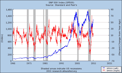
The graph below shows the long-term history of both the level of the S&P 500 and year over year change in the index.
Disclaimer: This page contains affiliate links. If you choose to make a purchase after clicking a link, we may receive a commission at no additional cost to you. Thank you for your support!

Leave a Reply