Bear with me. I’ve got a lot of graphs here (made jointly with Daniel Lee).
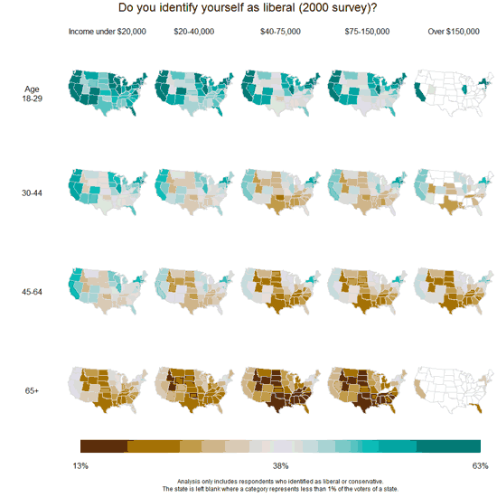
I’ll start with our main result. From the 2004 Annenberg surveys:
Providing health insurance for people who do not already have it–should the federal government spend more on it, the same as now, less, or no money at all?
The maps below show our estimated percentages of people responding “more” (rather than “the same,” “less,” or “none”) to this question:
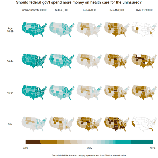
Increased government spending on health was particularly favored by people under 65 and those in the lower end of the income distribution. Older and higher-income people are much more likely to be in opposition. And, yes, there’s some variation by state–you can see a band of states in the middle of the country showing opposition–but age and income explain a lot more.
In the debates over the politics of health care, two issues keep coming up: demographics and geography. First, who are the people who support and oppose increased government involvement in health care? Is it a simple breakdown on party lines, or is there something more going on? Second, how much do attitudes vary from state to state? This latter question is particularly relevant when considering the actions of moderates in the Senate, many of whom come from moderate or conservative states.
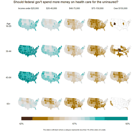
Unfortunately we don’t have access to recent polling data, but we found some interesting patterns when crunching the 2000 and 2004 Annenberg pre-election polls. Some changes have occurred since then–for one thing, the issue is now on the front burner politically, and survey respondents are now more evenly split on support for increased government involvement in health care–but the relative stability from 2000 to 2004 gives us a little bit of confidence that we’re seeing something real here, not merely an election-year blip.
Here’s 2000 (“Providing health care for people who do not already have it–should the federal government spend more money on this, the same as now, less or no money at all?”):
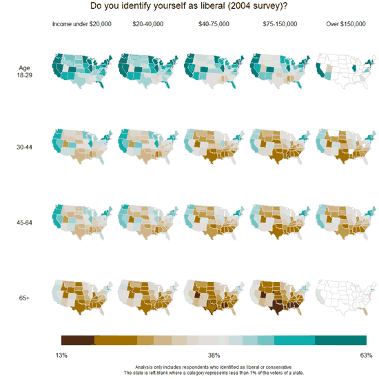
Comparison with party identification and ideology
OK, so health care is opposed by oldsters and richies (or, at least it was in 2000 and 2004, but I have no reason to doubt this is still happening now). Is that just because these are where the Republicans are?
No, it’s not so simple.
Here are maps of Democratic party identification (among those who identify with the Democrats or Republicans) in 2004 and 2000 (and, yes, we get similar pictures if we map vote intentions):
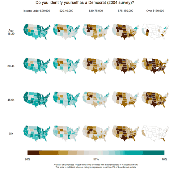
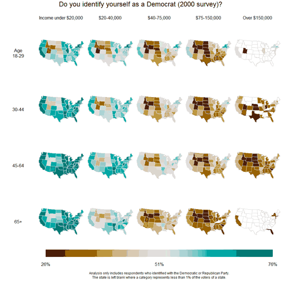
Richer people are more likely to identify as Republican. But, in comparison to the health care maps, we see almost nothing going on with age, and we see a lot more state-to-state variation.
We made a similar set of maps showing political ideology:
This time, age makes a big difference. Older people are much more likely to identify as conservative–even in 2004, when Barack Obama was a mere senatorial candidate, and in 2000, before Obama was even born. But the interaction with income is much weaker than in the maps of health-care attitudes shown above.
The age factor
One other thing. The age pattern on the top sets of maps above surprised us at first. After all, people over 65 have Medicare, which they’re generally satisfied with, so why wouldn’t they want this federal presence expanded? But, on second thought, maybe this makes sense: maybe they’re suspicious of expanded government involvement in health care because they see it as competing with Medicare for scarce dollars. (And, remember, these graphs are from 2000 and 2004, so you can’t attribute these patterns to any sort of recent political awakening involving Obama’s plans.)
But here’s something that bothered us at first. When I posted on “Seniors Skeptical on Health Care Spending” a couple of months ago, it looked like a pretty steady and continuous drop in support by age; for example:
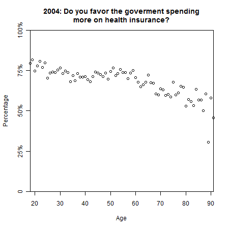
But in the top map above, there’s a sharp fall-off after age 65. What’s happening here? For the longest time I was sure we had a mistake, but then Daniel looked more carefully at the graphs of attitudes vs. age, and he pointed out that the graph is actually pretty flat between ages 30 and 60. From 18-30, there’s a drop–the youngest voters are particularly supportive of increased federal spending on health insurance–but voter turnout is very low for those under 25, so these people don’t show up so strongly in our summaries. Then, at the high end, the big dropoff occurrs beyond age 65: if you average all the over-65’s into a single category, you’ll see it’s much lower than the younger age groups. So it all ended up making sense.
Summary
1. The age and income factors are huge.
2. Opinion does not vary that much from state to state. People in liberal-leaning states are more supportive of Federal health care spending, and people in conservative states are less supportive, but the differences between states are small.
Little things
Yes, our multilevel modeling helped to smooth the data in a reasonable way. For example, here’s the very first set of maps above, redone using the raw data.
Disclaimer: This page contains affiliate links. If you choose to make a purchase after clicking a link, we may receive a commission at no additional cost to you. Thank you for your support!

Leave a Reply